

Moog Liberation pre-launch 1/2-page advertisement from page 52 in Contemporary Keyboard June 1980.
Update: added to the Moog interactive advertising timeline.
I've come to love pre-launch advertisements. The Sequential Circuits Pro-One series of pre-launch ads were simple but fun, and the Korg Sigma pre-launch ad was just gorgeous looking. Pre-launch ads usually just run in one issue, and I'll never think one month of advertising is enough for a magazine audience in the 70s or 80s, but I can't deny their appeal.
I love them so much I've created a new blog label called "pre-launch".
And the Liberation's simple but effective pre-launch advertisement doesn't disappoint either. I can't help but compare it to Moog's earlier Minimoog "KISS" (Keep It Simple, Stupid) ads - this September 1979 "When you've got the sound" colour ad, and this July 1979 "You know what this is" black and white ad (it doesn't even include a logo!). Simple. Effective.
This time, its the outline of the Liberation that is the focus of the ad. And any keyboardist even remotely (no pun intended) familiar with some of the more recognizable custom "keytar" instruments that had already been developed and played by Powell and others, would know what type of instrument Moog was about to launch. But, I wonder how good Moog was at keeping the actual specs of the Liberation a secret. I would have to think that prior to the Internet... pretty good.
I didn't cover any of the specs in my first Liberation ad blog post because the stats are pretty well documented on the Web. A simple Google search will bring up the familiar results:
And of course, if you want photos, look no further than a Google Images Search. And, really, all you need is this rather recent June 2011 MATRIXSYNTH auction post. It includes a wack of great close-up colour photos of the instrument, front panel and back. Just look at the shiny flashes of color on those controls!
Beautiful. Drool.
Lots more photos of other Liberations on MATRIXSYNTH too.
Wait a tick! I just noticed something that I had never clued into before... the logo-type font on the back of the Liberation in that MATRIXSYNTH auction post looks *nothing* like the Liberation logo-type font used for the word "Liberation" in this pre-launch ad or the Tom Schuman "Treat Yourself to FREEDOM" ad.
Here's a good photo of the back on the Liberation from that MATRIXSYNTH post.

Gah! I crave consistency!
But, even more interesting - Tom's Liberation definitely has that 60's style logo-type on the back panel - not that typical Moogy-looking font.

I did a quick scan through Google Images, and can't find a photo of a Liberation with the 60's style logo. Either Tom is playing a pre-production model or there are a few rare production Liberations with the old 60's style logo-type floating around out there.
Either way - Boo to the change! The Liberation was meant to be a fun instrument. And a fun instrument should have a fun 60's style logo! They should have kept it.
If you've seen one of these special Liberations (or own one!), please let me know.
End note: I just realized why exactly I get a little confused by Tom Schuman's photo in that other Liberation ad. He really does remind me of that guy from one of my favorite early 80's shows when I was a kid "The Greatest American Hero" - William Kat. I think Tom just needs to trade in the feathered hair for a perm.


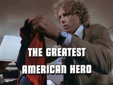
And, if you look at the T.V. show's intro, six seconds in you get to a familiar shot:
Look familiar? Remember that Syntar brochure cover...?


Hmmm. I'm starting to see connections everywhere.
Enough blogging for today :D
No comments:
Post a Comment